
Small Business Website Templates (What Your Site Needs, Features, Costs & Examples)
We checked 50 real small business websites. Most miss the basics. Here's what yours needs, what it costs, and the template that has it built in.
Contents
Short answer: a small business website needs to say what you do and where, prove it with reviews, and make one action easy on a phone: call, book, ask for a quote or buy. We checked 50 real small business websites against that list. Only 13 had a headline that named both the service and the town, and only 18 put a phone number on the first screen of a phone. For the same rules applied to live sites, see 17 Carrd website examples.
This guide is the list, feature by feature, with what those 50 sites got right and wrong. Then what changes by industry, what a website costs, and how to build one in an afternoon. Where one of our templates has a feature built in, it's shown under it.
What a Small Business Website Has to Do
Three jobs. Say what you do. Prove you can be trusted. Give the visitor one way to act.
Everything on the page serves one of those jobs or gets cut. A visitor who landed from Google or a friend's text message decides in a few seconds whether you're the right kind of business in the right place. If the page doesn't answer that on the first screen of a phone, they go back and tap the next result.
That's why most small businesses need one good page, not a ten-page site. More pages give a visitor more places to get lost and give you more pages to keep up to date.
How We Checked 50 Small Business Websites
In September 2026 we took 50 real US small businesses from Google Maps listings, 10 in each of five groups: contractors, local services, consultants and solo professionals, shops and hospitality, and creators. They came from seven mid-size metros, from Columbus to Sacramento. Chains, franchises and directories were left out.
We loaded each homepage in a headless browser, as an iPhone and as a desktop, and checked it for the features below. The page load figures are from one unthrottled lab run, not real-world field data, so a real phone on 4G will be slower. The sample is not a national statistic. It's what a typical Google listing's website looks like.
Before we even started, 10 of the 66 listings we tried linked to a dead website or to someone else's site. One pointed to an expired domain now serving gambling spam. Check the website link on your own Google listing today.
The 12 Features Every Small Business Website Needs
1. A headline that says what you do and where
Your H1, the big line at the top, should read like the answer to a search: "Roofing company in Tampa", not a slogan. Only 13 of the 50 sites named both the service and the location. 8 had no H1 at all, and 9 had more than one, the worst with 25.
Real headlines from the sample: "Welcome". "CONTACT US!". "Our Services". "by appointment only:". None of them tells a stranger what the business does.
Check yours in a minute: read only your top headline. Would someone who has never heard of you know the service and the town?
2. A phone number you can tap, on the first screen
Most visitors are on a phone, and for most local businesses a call is the best lead there is. Only 18 of the 50 sites put a phone number or a call button on the first screen of a phone.
The number was usually somewhere: 32 of the 50 had a click-to-call link on the page. It was just too low. 15 sites had a tap-to-call link and still nothing on the first screen. 8 showed their number as plain text you can't tap, and 10 had no phone number on the homepage at all.
Desktop and phone are different checks. 4 sites showed the number on desktop only, so the check has to be done on a real phone.
Check yours in a minute: open your site on your phone. Can you call yourself without scrolling?
3. One clear action
Pick the one thing you want a visitor to do: call, book, request a quote, or buy. Put it on the first screen and again at the bottom. Two competing buttons halve both.
17 of the 50 sites had nothing to act on in the first screen of a phone: no phone, no button. 22 had no form and no booking link anywhere on the homepage. If people book a slot with you, the button should open the system that actually takes bookings. Don't rebuild a calendar on the page.
If you have a form, someone must read it and answer. A form nobody reads is worse than no form. And if the job is priced after a visit, ask for the job, the address or area, and a photo if it helps. "Message" is not a field.
4. Reviews on the homepage
Proof comes before price. Only 15 of the 50 homepages showed reviews or testimonials. Among contractors, whose customers check reviews before they call, it was 3 of 10. Among local services, 2 of 10.
You don't need a widget. Three short quotes with a first name and a town, copied from your Google reviews with permission, do the job.
5. Where you work: service area and address
Name the towns you serve in the text, not only in the footer. 34 of the 50 sites mentioned a place outside their address, and 33 showed a street address. For a storefront, the address is content. For a contractor, the list of towns is.
6. Opening hours, if people come to you
If you have a door people walk through, hours belong on the homepage. Only 8 of the 20 local service businesses and shops in the sample showed their hours there.
7. A link to your Google Business Profile
Your Google profile holds your reviews, your hours and your directions. Link to it. Only 14 of the 50 sites did, and 10 embedded a map. It's the cheapest proof you have: hundreds of strangers have already vouched for you there.
8. Credentials and licence number
If your business is licensed, the licence or credential line sits near the top, next to your name. Only 1 of the 10 contractors showed a licence number, and 7 of 10 never used the word "licensed".
To be fair to them, 6 of those 10 were in Ohio, where many contractors have no state licence. But in states that license contractors, the number on your advertising is often required. California, Arizona and Florida require the contractor licence number on advertising, and a website counts. California also requires the exact business name as registered and prohibits advertising as "bonded". Put the number in the header or the first section, not the footer.
9. Real photos of your work
We didn't score this one; a script can't tell a real job photo from a stock image. The rule still stands: photos of your own work, your own shop, your own face. For contractors, group project photos by job type, not by date. A stock-photo hero tells the visitor nothing about you.
10. A page that loads fast on a phone
The median homepage in the sample weighed 1,994 KB and made 70 requests. 18 of the 50 took more than 2.5 seconds to show their main content, the threshold Google treats as "needs improvement", and that was on a fast connection. The heaviest homepage weighed 48,264 KB, 271 times the lightest.
The usual culprits are uncompressed photos, autoplay video and a stack of scripts nobody remembers adding. A one-page site with a few compressed images stays small by default.
11. The basics Google reads: page title and description
Your page title is what shows as the blue link in Google. 6 of the 50 started with "Home", and one was just "Home". 12 had no meta description, the grey text under the link, and 14 of the 38 that had one ran past 160 characters, so Google cuts it off.
Check yours in a minute: search your business name. Does the blue link say what you do and where?
12. A privacy policy and working analytics
26 of the 50 had no privacy policy link. If you have a form or any tracking, you need one. For contractors it was 7 of 10.
We found no analytics at all on 19 of the 50. Some run on a website builder's built-in statistics, which our check can't see. One site's only tracker was the old version of Google Analytics, which Google no longer processes. If you can't tell how many people visit, you can't tell whether any change works.
The 12-point checklist
- The headline names your service and your town.
- A tap-to-call number is on the first screen of a phone.
- One action, on the first screen and at the bottom.
- Reviews on the homepage.
- The towns you serve, and your address if people visit.
- Opening hours, if people come to you.
- A link to your Google Business Profile.
- Your licence or credentials near the top.
- Real photos of your work.
- Main content visible in under 2.5 seconds on a phone.
- A page title and meta description that say what you do.
- A privacy policy link and analytics you actually check.
Say what you do and where, prove it, and make one action easy on a phone. The industry decides the proof and the action.
What Changes by Industry
The 12 features apply to everyone. What changes is the proof that matters most and the one action you ask for.
Contractors
A contractor's page turns someone who just searched your name, or got your number from a neighbour, into an estimate request. Four things, in this order: licence and insurance line, the areas you serve, photos of finished jobs, an estimate form. Skip the "about us" essay.
In the sample, 9 of 10 contractors had a tap-to-call link somewhere, but only 4 of 10 put it on the first screen of a phone. That's the cheapest fix on this page.
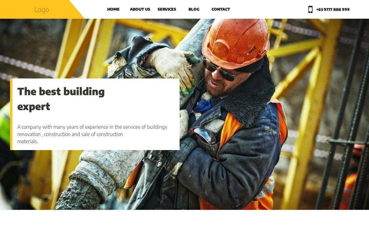
Construction and renovation: project photos carry the page. Group them by job type.
33 sites built with this template
Best for contractors who win work through photos of past jobs
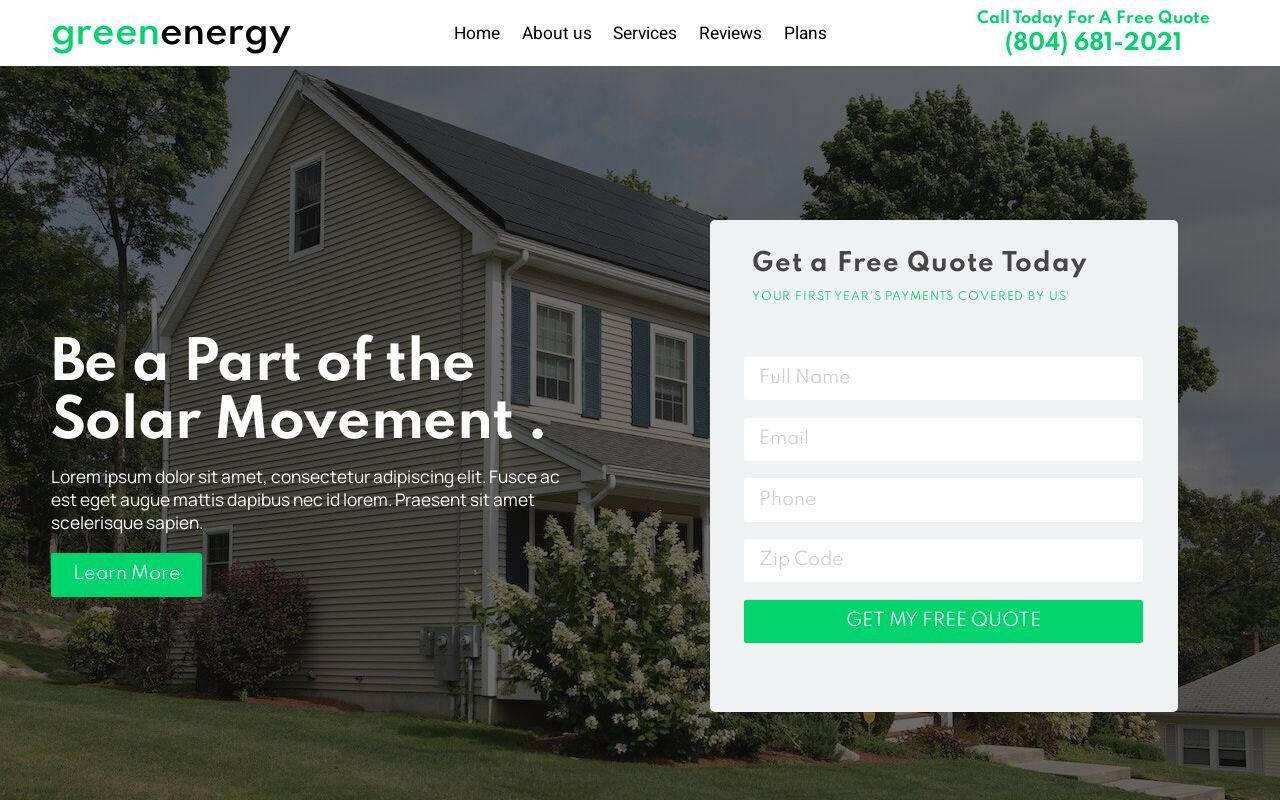
Solar and green energy: a savings or financing line before the form. The visitor is comparing quotes; give them the number they're looking for.
267 sites built with this template
Green Energy
$49Best for solar installers who want quote requests, not just visits
Landscaping and hardscaping: big images first, services second. This is the one contractor page where the gallery goes above the services list.
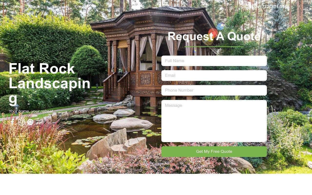
Best for landscapers whose gallery sells the next project
Roofing, HVAC, electrical, plumbing, painting, fencing, concrete, handyman: the same four things, plus the section that kind of contractor needs: storm and insurance work for a roofing company, an emergency line for HVAC and plumbing, interior and exterior work for a painting company, per-foot pricing for fencing. Dedicated templates for each are coming; until then the construction template is the closest fit.
Local services
Three things: what you do, where you are, how to book or order. Hours and the address are content here, not footer filler. Only 2 of the 10 local service homepages in the sample showed reviews, so this is where a few quotes stand out most.
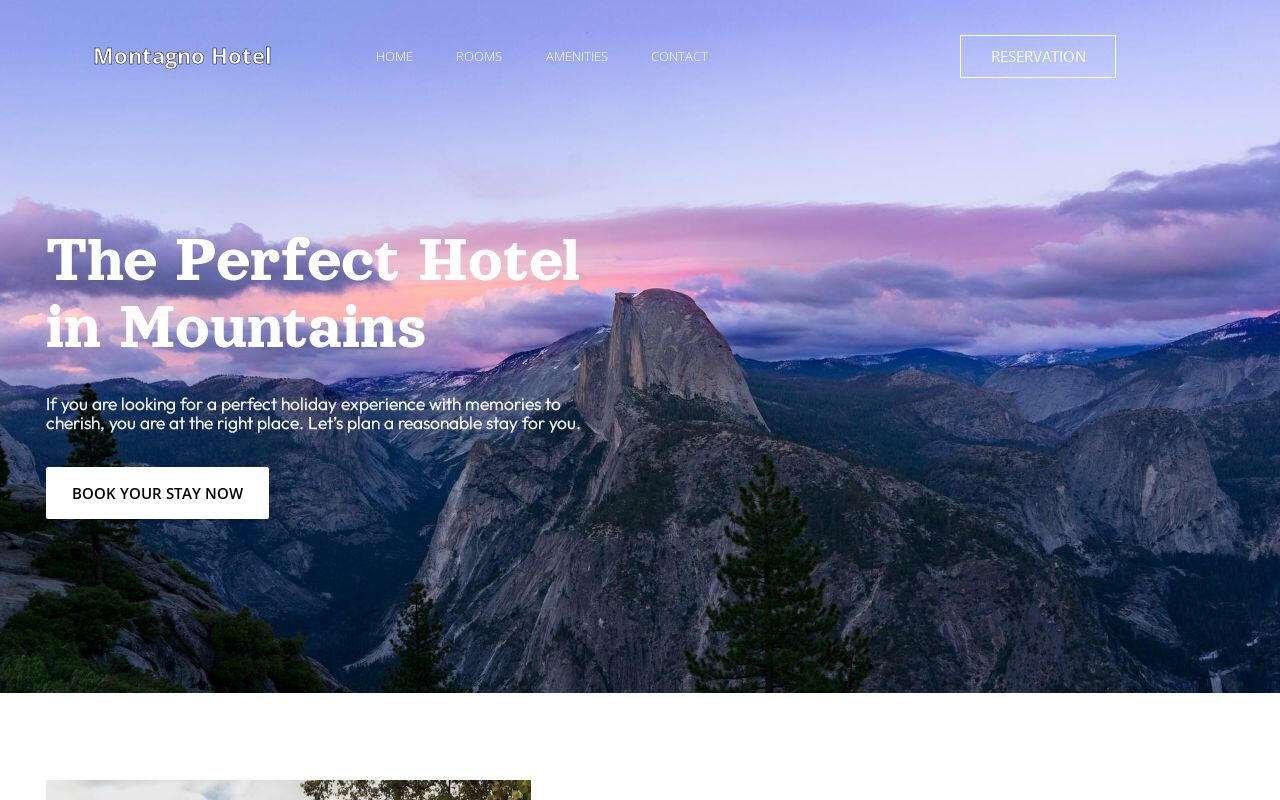
Hotels and hosts: rooms, location, one reservation button that links to where you actually take bookings.
Shops taking orders: the products people ask for most, the hours, and an order link. A florist's page is a menu, not a brochure. In the sample, only 1 of 10 shops put a phone number on the first screen of a phone, and none had a contact form.
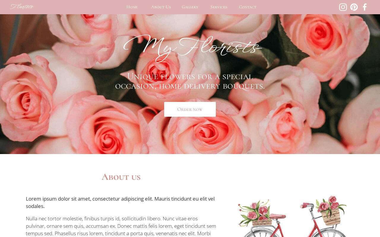
Flower Shop
$49Best for flower shops taking orders from one simple page
Accountants and tax offices: services, who they're for, credentials, one consultation form. Credentials are the proof here, so put them next to the name, not on a separate page.
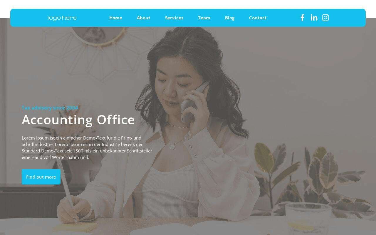
Best for accountants who want consultation requests, stated plainly
Consultants and solo businesses
If you are the business, the page is a "hire me" page: what you do, how you work, one way to get in touch. Show the process. It qualifies the call before it happens.
Consultants selling a complex service: walk the reader through your process and expertise before the contact form, so the first conversation is with someone already convinced.
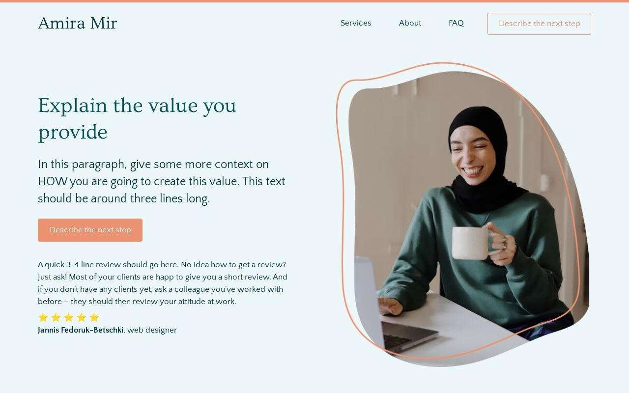
34 sites built with this template
Calgary
$49Best for consultants who want to look booked-out by Friday
Coaches and bookkeepers: see the coaching website template and the bookkeeping website template, each shown filled in.
Freelancers: bio, services, three pieces of work, availability, contact. Not a portfolio of forty items.
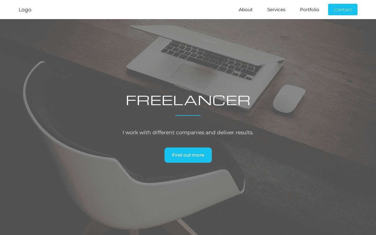
Freelancer
$49Best for freelancers who need a "hire me" page, not a website
Creators and digital products
One offer per page. If you have three, you have three pages. Proof goes between the promise and the price. Creators had the heaviest pages in the sample, with a median of 3,891 KB, mostly from full-size photos. Compress them before you upload.
Creators building a list: the email signup is the action, and the offers are the reason to give an email.

Best for creators building an email list from day one
Selling a course or a partnership: one offer, proof, price, buy button. The page exists before the academy does.

Influencer
$49Best for selling a course before building an academy
Launching a book: what the reader gets, who wrote it, what others said, buy.
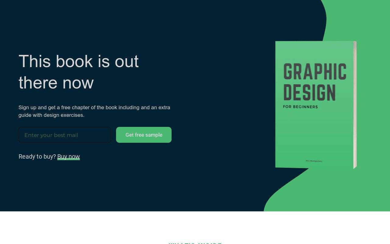
Best for authors launching one book with one page
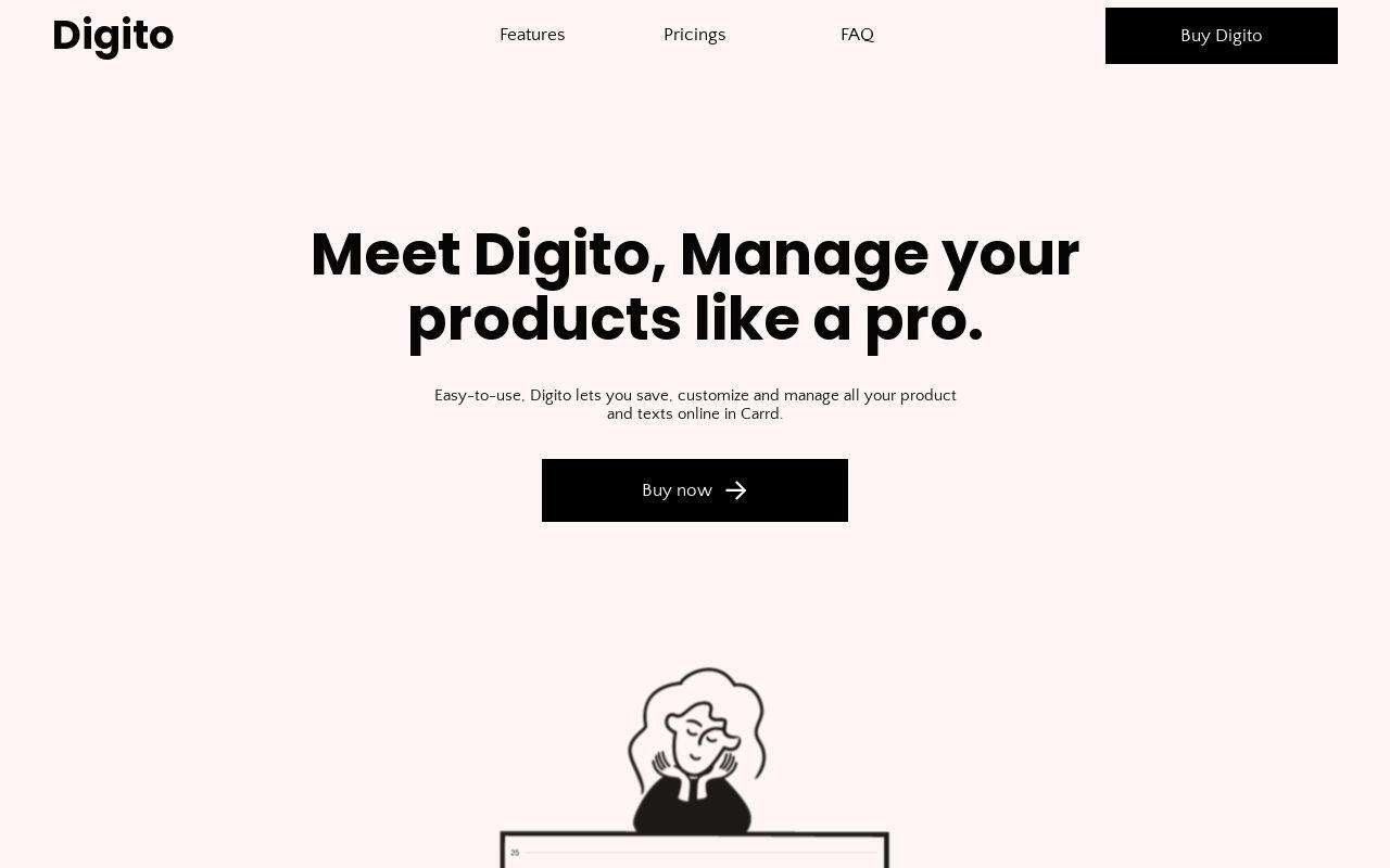
Launching one digital product this week: the shortest page in the catalog to fill in.
Software products
A landing page, not a site: value proposition, features, proof, pricing, one call to action. Enough to validate, demo and sign early customers. More in the SaaS landing page guide.
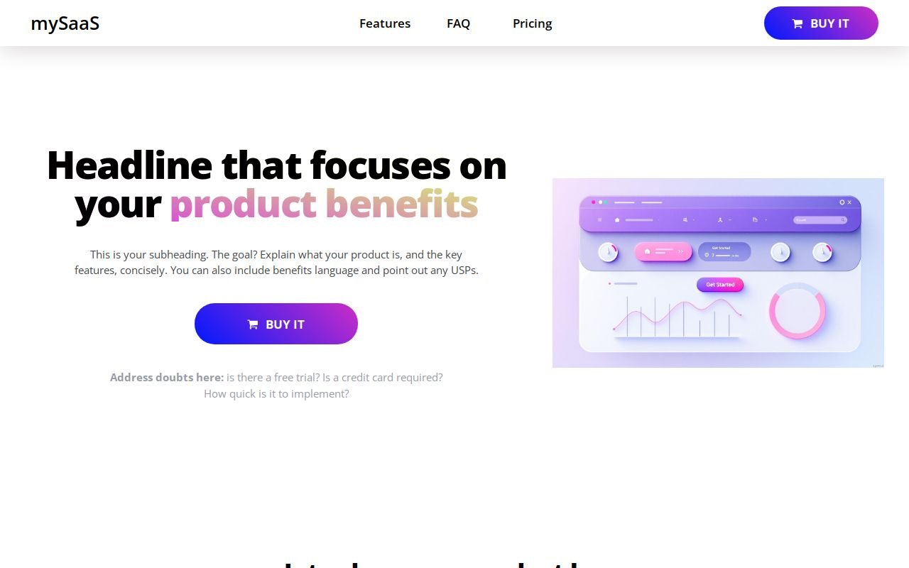
SaaSo
$49Best for a simple SaaS or digital product that needs one clean landing page
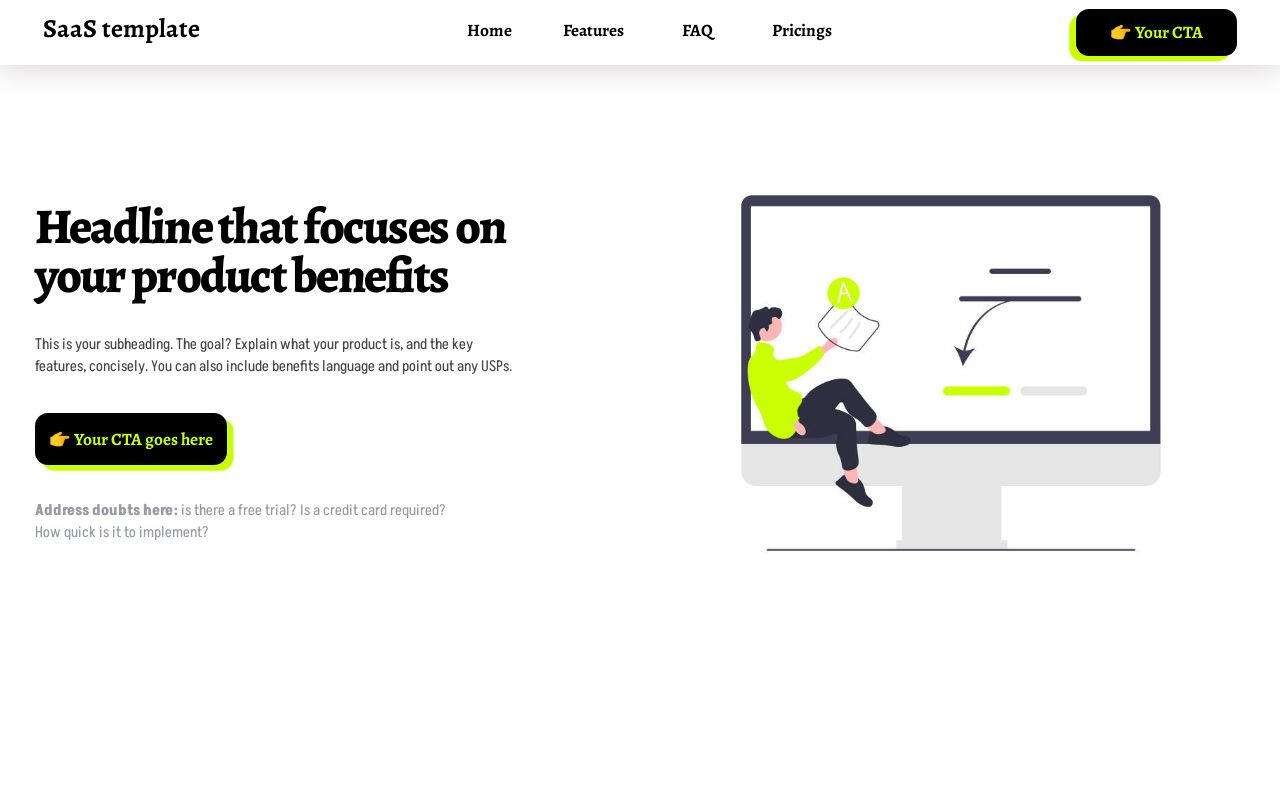
Best for software products that need a landing page, not a site build
Add-ons
Not sites. The cookie banner drops a consent bar into any Carrd page.
Best for any Carrd site that needs a consent banner today
What a Small Business Website Costs
Four routes, from cheapest to most expensive. The yearly figures are for the first year and were checked on each provider's own pricing page in September 2026.
| Route and your time | First-year cost |
|---|---|
| One-page template on Carrd Carrd Pro Standard plus a domain plus a one-time template Time: an afternoon | $19 for Carrd, $10–20 for the domain, plus the template |
| Website builder plan Wix, Squarespace and similar Time: a few days | Wix Light: $17.77 a month billed yearly, about $213. Squarespace's Basic plan is in roughly the same range. |
| WordPress you run yourself Hosting, theme and plugins Time: days to weeks, plus updates | $300–800 a year before anyone maintains it |
| Agency or freelancer build Time: meetings and feedback rounds | Quoted per project; ask for a fixed price and what any monthly fee covers |
The cheapest route is not always the right one, but for a one-page business site the extra money in the other routes buys features the page won't use. The full breakdown of the WordPress side is in WordPress vs Carrd.
How to Build One in an Afternoon
- Write the four lines first. What you do, where, the proof, and the one action. If you can't write them, no template will fix it.
- Pick a template made for your kind of business. It saves you from designing the order of sections, which is the part people get wrong.
- Replace everything with your own. Your headline, your photos, your reviews, your phone number as a tap-to-call link.
- Connect your domain and the form. Send a test enquiry to yourself and make sure it arrives.
- Run the 12-point checklist on your phone. Then update the website link on your Google Business Profile.
Every template here runs on Carrd: fast, $19 a year on Pro Standard, nothing to update or patch. If you've never used it, the how to use Carrd guide covers the editor, forms, payments, domains and SEO step by step.
The 7 Most Common Mistakes
Ranked by how many of the 50 sites made them:
- The headline doesn't name the town: 37 of 50.
- No link to the Google Business Profile: 36 of 50.
- No reviews on the homepage: 33 of 50.
- No opening hours: 33 of 50.
- No phone number on the first screen of a phone: 30 of 50.
- No privacy policy link: 26 of 50.
- The headline doesn't say what the business does: 23 of 50.
None of these costs money to fix. Most take ten minutes.
When One Page Isn't Enough
One page is the right answer for most small businesses, not all. You need more when each service or location has to rank on its own, when you publish regularly, or when you sell more than a handful of products. At that point, pick the tool built for that need. The honest list is in Carrd alternatives.
Final Thoughts
Before you change platforms or pay anyone, open your site on your phone and run the 12 points. Fix the headline and the phone number first; in our sample, those two alone would have changed the first screen of more than half the sites. If the page needs rebuilding anyway, start from a template made for your kind of business and spend the afternoon on your own words and photos, not on layout.
Looking for something specific? Drop me a line and I'll help you find the right template for your business.
— Franck J · franckj.com
Pick your industry, then the template
Every template is $49, one-time, applied to your own Carrd account.
Browse all templates →