
Awesome CSS Image Hover Effects That You Can Use on Your Carrd Website
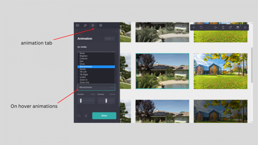
Carrd has its hover animations which are easy to use without knowledge of CSS.
There are 11 native animations:
But in specific situations, you might need much more but don’t worry because animating pictures using CSS on Carrd is a simple process that can add an extra level of engagement to your website.
Here are the steps to add a simple animation to a picture on Carrd:
Add embed element, change style for the hidden head then add one of those:
Shaking image on hover
.shaking-image {
transition: all 0.5s;
}
.shaking-image:hover{
animation: shake 0.5s;
}
@keyframes shake {
0% { transform: rotate(2deg); }
10% { transform: rotate(-2deg); }
20% { transform: rotate(2deg); }
30% { transform: rotate(-2deg); }
40% { transform: rotate(2deg); }
50% { transform: rotate(-2deg); }
60% { transform: rotate(2deg); }
70% { transform: rotate(-2deg); }
80% { transform: rotate(2deg); }
90% { transform: rotate(-2deg); }
100% { transform: rotate(0deg); }
}
Jump animation on hover
<style>
.jump {
 transition: all 0.3s;
}
.jump:hover{
 animation: jump 0.5s;
}
@keyframes jump {
 0% { transform: translateY(0); }
 50% { transform: translateY(-30px); }
 100% { transform: translateY(0); }
}
</style>
Twist animation on hover
.twist {
transition: all 0.3s;
}
.twist:hover{
animation: twist 1s linear infinite;
}
@keyframes twist {
0% {
transform: rotateY(0deg) rotateX(0deg);
}
100% {
transform: rotateY(360deg) rotateX(360deg);
}
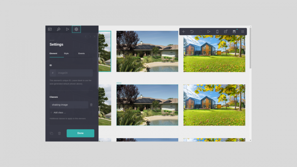
}In the end, go to the image you want to animate to section settings (gear icon) and add the class name like in the picture below:
Those are just 3 examples of CSS animations that you can use but not only, Carrd allows you to add almost any kind of CSS animation.
See more templates | Try Carrd | Need help? Contact me.


Leave a Reply